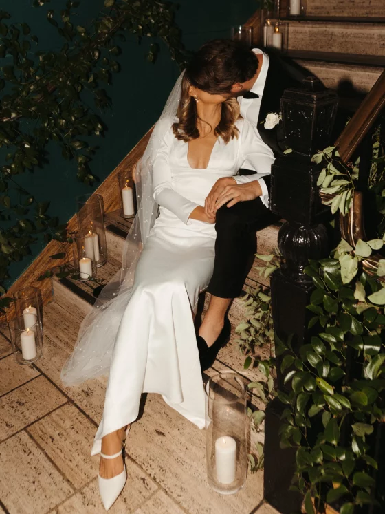
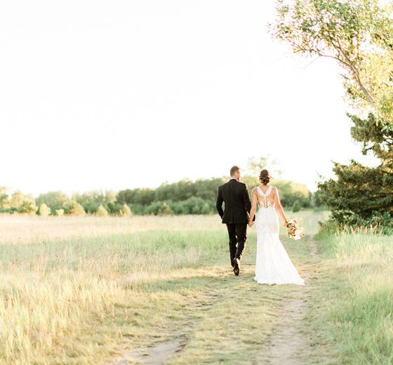
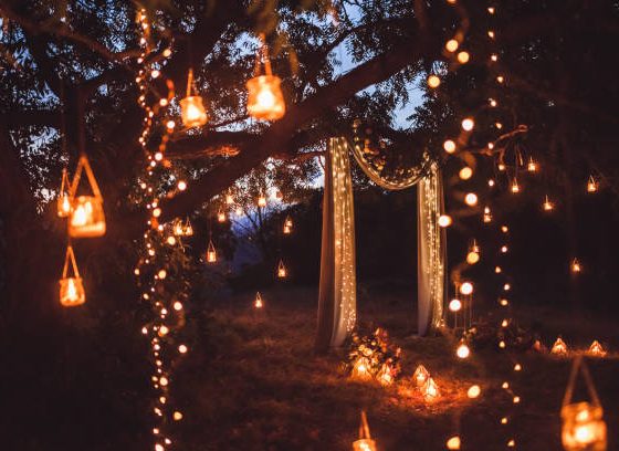
Today’s post is an exciting and helpful one! FTD is sharing with all of you some amazing Pantone 2017 color floral trends and how you can incorporate them into your day!
Greenery, the Pantone color of the year, is one of the hottest wedding trends right now. But did you know that Pantone released their spring color report as well? This year’s report includes both soft and delicate hues accented by bright and bold pops of color, creating a palette that is both classic yet eclectic.
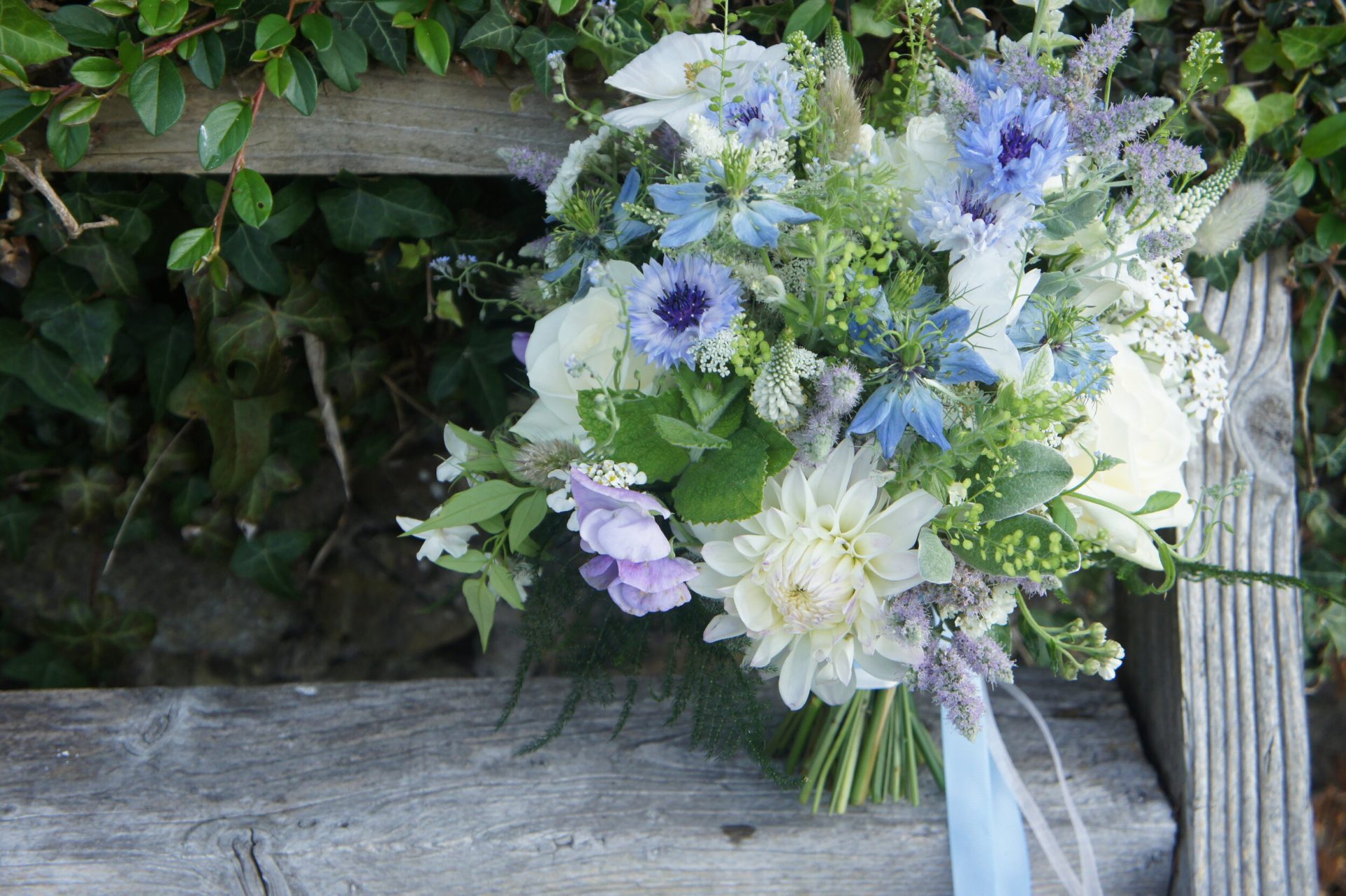
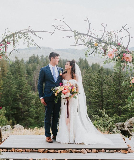
Of course, flowers are the best way to incorporate these trendy colors into your wedding decor. To help you match the best blooms to your favorite Pantone colors, FTD created these mood boards below featuring this year’s hottest colors including: Greenery, Pale Dogwood, Hazelnut, Pink Yarrow, and Primrose Yellow. Each board showcases an assortment of wedding flower arrangements including bouquets, centerpieces and ceremony arches that feature Pantone-inspired wedding flowers. Check out the mood boards below for creative wedding flower ideas!
Pantone Greenery
Pantone’s color of the year, Greenery is the perfect hue for spring and summer weddings. This color is light, vibrant and refreshing. Check out the mood board down below to see some super pretty ways to incorporate plants and flowers into your wedding day!

Top left: Summer Street Photography | Bottom right: Jeff Loves Jessica Photography
Pale Dogwood
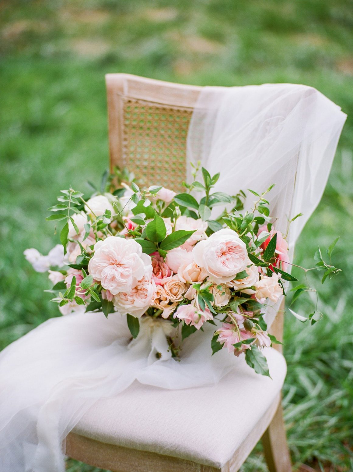
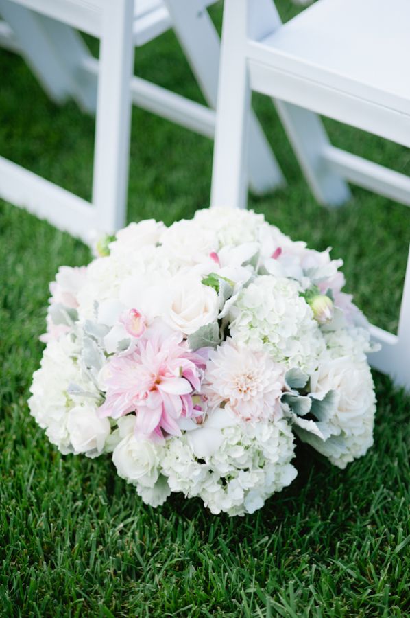
So, this is my favorite color for spring and summer 2017 weddings. There is just something so soft and pretty about the color Pale Dogwood. The soft hue of pink is just such a versatile color to work with. Pale Dogwood pairs amazing with neutrals and I am a lover of neutral pallets. Look down below for some soft pretty Pale Dogwood inspo!
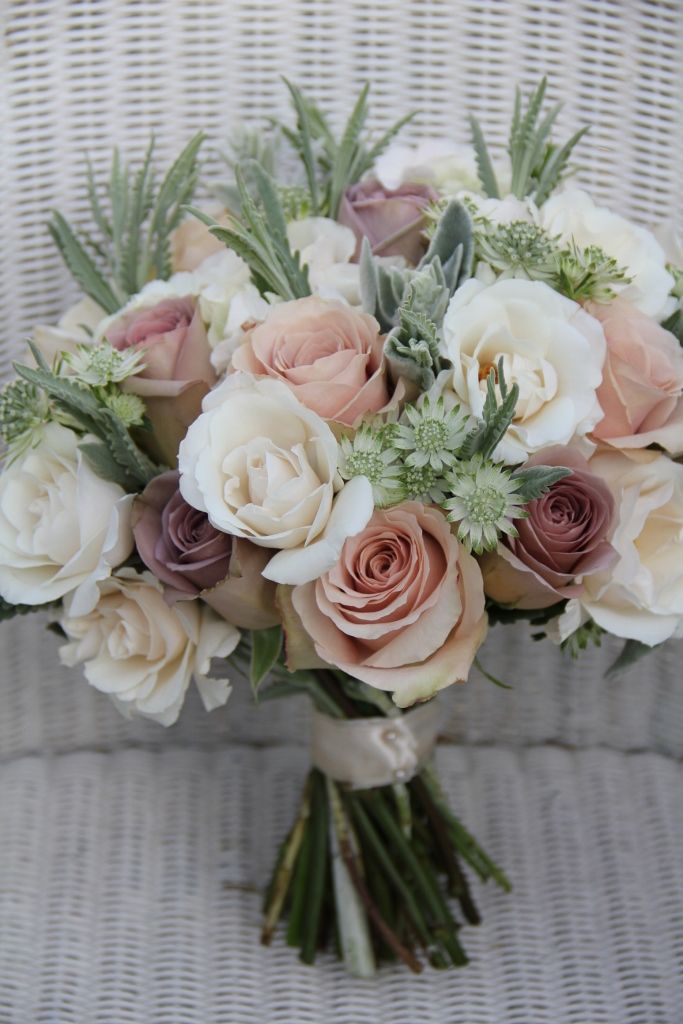
Bottom right: All My Love Photography, Floral Design by: Pink Dahlia Vintage
Pink Yarrow
I can already tell that this beautiful, bold pink color is going to be a big hit this spring and summer. This color is all about grabbing your attention. Pink Yarrow is perfect for a tropical pallet or just for bold pop of color through out your wedding. If your looking to add some drama to your wedding day flowers. take a peek at the mood board below.
Top left: Love by Serena | Bottom right: Ann & Kam Photography
Hazelnut
Like I mentioned before I am obsessed with neutral color pallets so, this Hazelnut color is my second favorite of the mood boards. The most amazing thing about Hazelnut is that it can be easily incorporated into any season or any color pallet. It’s just so relaxing, calm and pretty. Check out some creative ways to use Hazelnut in your wedding down below.
Top right: Jemma Keech Photography | Bottom right: Chudleigh Weddings
Primrose Yellow
This bright and joyous color is obviously an amazing pick for a 2017 spring or summer wedding. I mean, who doesn’t love a gorgeous sunflower? It is bold, uplifting and just makes us smile. You can easily add Primrose Yellow to your wedding just check the mood board below!
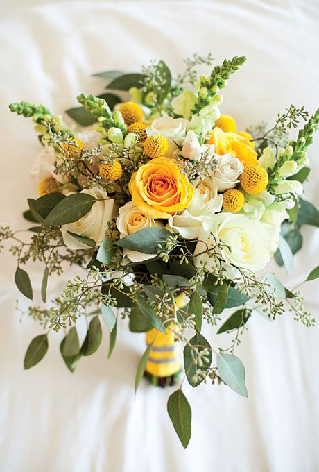
Top left: Marta Locklear Photography | Top right: Laura’s Focus Photography | Bottom right: Anna Sawin Photography
If you liked what you saw in this post and want to learn more about these flowers, make sure to check out FTD. They have amazing flowers for every occasion.
Let us know what mood board was your favorite in the comments below!
